
Quick Answer
Epic fantasy: Cinzel or Trajan Pro. Urban fantasy: Bebas Neue. If you can’t read it at thumbnail size on Amazon, it’s the wrong font.
I’ve designed over 1,000 book covers — hundreds of them fantasy — and the font choice makes or breaks the cover more than almost anything else. A great illustration with the wrong font looks amateur. A simple background with the right font looks professional.
A few years ago I made an epic list of 300+ fonts by genre. But honestly, some of those are dated now. So here’s my updated, curated list of fantasy fonts I actually use in 2026 — organized by subgenre so you can find what fits your book.
Need a cover layout to try these fonts on?
My DIY Book Design & Formatting Bundle has 150 editable Microsoft Word cover templates (80 fiction, 70 nonfiction), interior formatting templates for print and ebook, and five courses that show you how to make them fit your book. Code BUNDLE takes it from $197 to $37.
See the DIY bundle ($37 with code BUNDLE)
Templates and self-paced video lessons. You do the design work yourself.
Best epic/high fantasy fonts
Epic fantasy readers expect elegance, weight, and a sense of history. Think Tolkien, Sanderson, Martin. These fonts say “ancient kingdoms and magic systems” without being illegible:
- Cinzel — Roman-inspired capitals, perfect for one-word titles. Free on Google Fonts.
- Trajan Pro — The classic epic fantasy font (used on countless bestsellers). Adobe Fonts.
- EB Garamond — Elegant old-style serif, beautiful for longer titles. Free on Google Fonts.
- Cormorant Garamond — More decorative than EB Garamond, works at large sizes. Free.
- Spectral — Clean, modern serif with historical feel. Free on Google Fonts.
- Sorts Mill Goudy — Warm, readable, classic book feel. Free.
Pro tip: Epic fantasy covers almost always use ALL CAPS for the title. If your font looks weird in all caps, pick a different one.
Best urban fantasy and paranormal fonts
Urban fantasy is modern, sharp, dangerous. Think Jim Butcher, Ilona Andrews, Patricia Briggs. The fonts need to feel contemporary with an edge — not medieval:
- Bebas Neue — Tall, bold condensed sans-serif. Extremely popular for urban fantasy. Free.
- Montserrat Black — Heavy geometric sans-serif, works well with gritty imagery. Free.
- Oswald — Condensed, modern, slightly industrial. Free on Google Fonts.
- Rajdhani — Angular, technical feel — good for sci-fantasy crossovers. Free.
- Anton — Thick, impactful display font. Good for single-word titles. Free.
Best dark fantasy and grimdark fonts
Dark fantasy wants atmosphere — something that feels slightly unsettling, textured, weathered. Think Joe Abercrombie, Mark Lawrence, Anna Smith Spark:
- Almendra — Slightly organic serif with medieval character. Free on Google Fonts.
- Uncial Antiqua — Celtic/uncial style without being unreadable. Free.
- MedievalSharp — Blackletter-adjacent but still legible. Free.
- Metamorphous — Stone-carved feel, heavy and ancient. Free.
- Pirata One — For anything pirate or sea-adventure adjacent. Free.
Warning: Blackletter fonts (the really ornate medieval ones) are almost always unreadable at thumbnail size. They look cool in isolation but they’ll kill your Amazon sales. If you love the aesthetic, use blackletter for a decorative initial cap only — not the full title.
My curated fantasy font collection (visual reference)
Here’s a visual showcase of fonts I’ve used on real fantasy covers. I started this collection while working on a cover for a fantasy prequel called “Death of Magic” — can you tell which font we chose?
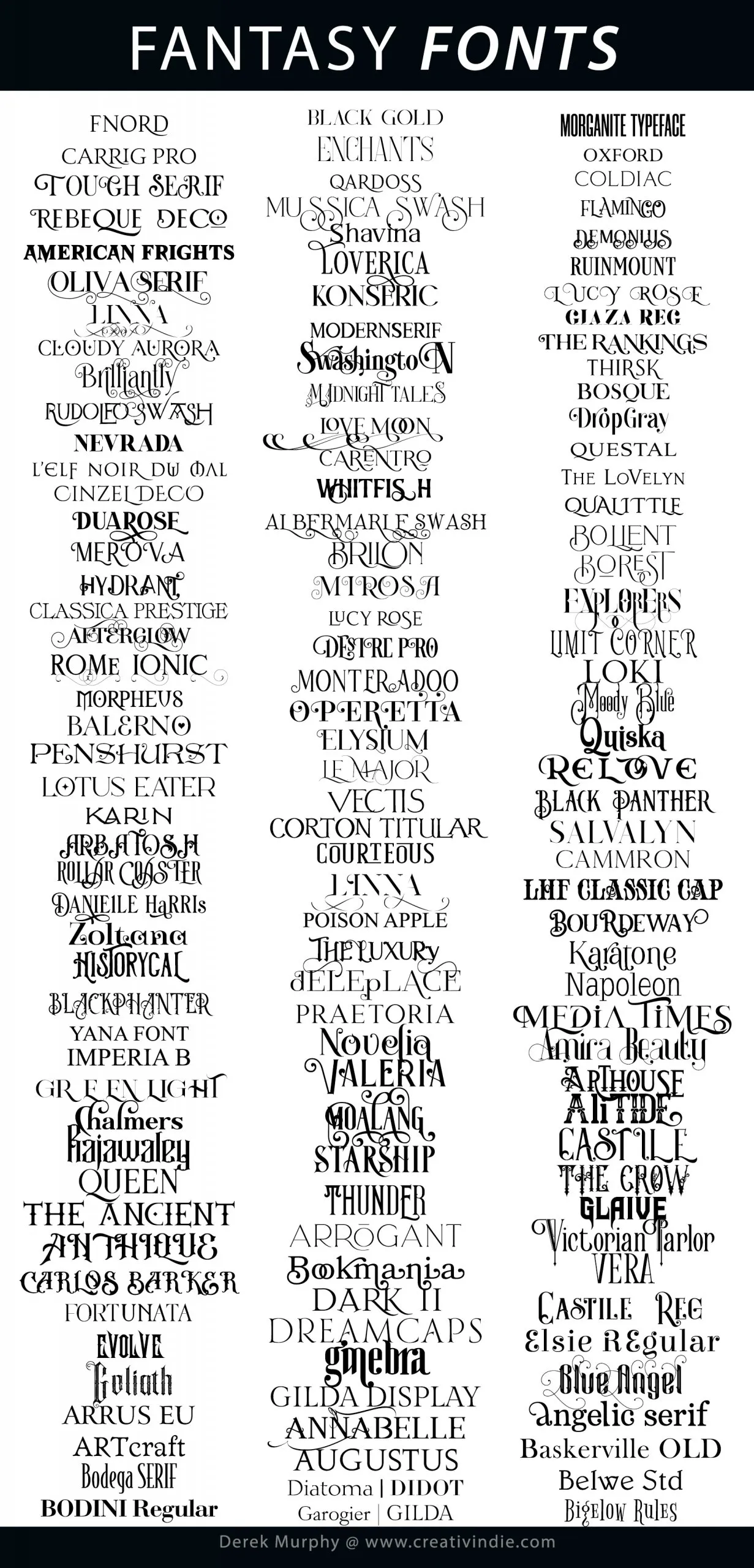
And here’s a sample of free fantasy fonts available in my online cover maker tool:

The 5 rules of fantasy cover typography
After designing 1,000+ covers, here’s what I’ve learned the hard way:
- Thumbnail test first. Shrink your cover to 100px wide. If you can’t read the title and author name, start over.
- One decorative font maximum. Title can be decorative. Author name should be clean (Montserrat, Lato, or a simple serif). Never two decorative fonts competing.
- Match the subgenre signals. Epic = serifs. Urban = sans-serifs. Dark = textured. Romance crossover = script accents. Readers make split-second genre judgments based on typography alone.
- White or light text on dark backgrounds. Most fantasy covers are dark. Light text pops. If your background is light, use a heavy-weight dark font. Never medium-gray text on a medium-tone background.
- Don’t use more than 2 fonts total. Title + author name. Maybe a subtitle in the author name font. That’s it. Three fonts on a cover always looks amateur.
Romantasy Fonts
Romantasy (romance + fantasy) is the fastest-growing subgenre in publishing right now, and the cover typography has a look that readers recognize instantly: elegant serifs with a slight flourish, metallic effects, and colors that lean toward rose gold, champagne, or deep jewel tones. Here are the fonts that signal “enemies-to-lovers in a fae court” without saying a word:
- Cormorant Garamond — Free on Google Fonts. Tall, refined, slightly dramatic. Works beautifully for romantasy titles. Pair with Lato or Source Sans for the subtitle.
- Playfair Display — High contrast, elegant, modern-classic. The go-to for romantasy covers that want to feel upscale without being fussy.
- Cinzel Decorative — Free. All-caps display font with decorative serifs. Reads as “ancient power meets beauty.” Perfect for titles with words like “court,” “crown,” “throne.”
- Marcellus — Free. Clean, classical, reads well at small sizes. Great for author names under a flashier title font.
- EB Garamond — Free. If you want something more restrained; literary romantasy, adult fantasy romance, anything that does not want to scream “fae smut.”
- Didot — Fashion-magazine elegance. High contrast strokes. Signals luxury. Works for romantasy that skews more toward romance than fantasy.
The trick with romantasy covers is that the font does half the work. Readers browse by thumbnail. If your title font looks like it belongs on a thriller, you will attract the wrong readers no matter how gorgeous the illustration is. The typography is the genre signal. Get it right and everything else clicks.
Sci-Fi Fonts for Book Covers
Science fiction covers need fonts that feel futuristic without being illegible. The genre has two visual lanes: hard sci-fi (clean, technical, minimal) and space opera (bold, cinematic, sometimes retro). Here are the best fonts for each:
| Font | Style | Best For | Free? |
|---|---|---|---|
| Orbitron | Geometric, futuristic sans-serif | Hard sci-fi, cyberpunk, tech thrillers | Yes (Google Fonts) |
| Rajdhani | Sharp, angular, readable | Military sci-fi, near-future thrillers | Yes (Google Fonts) |
| Exo 2 | Rounded geometric, friendly-futuristic | Space opera, YA sci-fi, lighter tone | Yes (Google Fonts) |
| Michroma | All-caps, wide, mechanical | Alien encounters, AI themes, dystopia | Yes (Google Fonts) |
| Eurostile | Classic sci-fi (used in 2001: A Space Odyssey) | Retro sci-fi, space exploration, NASA aesthetic | No (commercial) |
| Nasalization | NASA-inspired, clean, technical | Space travel, first contact, exploration | Free for personal |
Avoid the temptation to use a “futuristic” font that sacrifices readability. If readers cannot tell what your title says in a one-inch thumbnail on Amazon, you have lost the sale before they even read your blurb. The best sci-fi fonts are geometric, clean, and slightly unusual; not illegible.
Thriller and Horror Fonts
Thrillers and horror share a visual language: sharp edges, high contrast, distressed textures, and colors that skew toward red, black, and white. The font needs to feel dangerous.
- Bebas Neue — Free. Tall, condensed, all-caps. The workhorse of thriller covers. Clean enough to read, aggressive enough to signal danger.
- Impact — Built into every OS. Bold, heavy, impossible to ignore. Works for action thrillers, less so for psychological suspense.
- Trade Gothic Bold Condensed — The font of airport paperbacks. Commercial, punchy, professional. Signals “bestseller” instantly.
- Creepster — Free on Google Fonts. Obviously horror. Dripping, jagged, B-movie energy. Use for campy horror, not literary.
- Nosifer — Free. Distressed, cracked, looks like it was carved into a wall. Works for supernatural horror, demonic themes.
Font Pairing: Title + Author Name
The biggest mistake self-published authors make with cover typography is using the same font for the title and the author name. Professional covers almost always pair two fonts: a display font (decorative, eye-catching) for the title and a clean, readable font for the author name and subtitle. Here are pairings that work:
| Genre | Title Font | Author Name Font | Why It Works |
|---|---|---|---|
| Epic Fantasy | Cinzel Decorative | Lato | Ancient + modern. The title feels like a kingdom; the name feels professional. |
| Romantasy | Playfair Display | Source Sans Pro | Elegant serif + clean sans-serif. Signals upscale romance without being fussy. |
| Sci-Fi | Orbitron | Rajdhani | Both geometric, both futuristic, but different weights create hierarchy. |
| Thriller | Bebas Neue | Open Sans | Bold condensed + neutral. The title punches; the name stays out of the way. |
| Literary Fiction | EB Garamond | Montserrat | Classic serif + geometric sans. Says “serious but approachable.” |
Where To Get Fonts (Free and Paid)
Most of the fonts on this page are free, but if you want commercial-grade options with extended licenses, here is where to look:
- Google Fonts — Free, open source, and the quality has gotten shockingly good. Cinzel, Playfair, Cormorant, Orbitron, Bebas Neue are all here.
- DaFont — Massive free library, but check the license (some are free-for-personal only). Great for finding unusual display fonts.
- Font Squirrel — Curated free fonts, all with commercial licenses. Smaller collection but everything is usable.
- Creative Market / Envato Elements — Paid subscriptions or one-off purchases. Premium fonts with full commercial licenses. Worth it if you design covers regularly.
One more thing: you can test any of these fonts on your cover idea in about thirty seconds. My DIY Book Covers tool lets you drag in your own image and swap fonts in real time; no Photoshop, no download, no design degree. If you already have a manuscript and want it formatted for print or ebook, DIY Book Formats handles the interior typography.
If you want a deeper dive into book cover typography across all genres (not just fantasy), I have a much bigger list of 300+ book cover fonts organized by genre, and a post on the 8 fonts every book layout needs.
Make your cover now (free tool)
I built a free online book cover maker that includes many of these fonts built in — you can pick your art, choose a font, adjust sizing, and download a print-ready cover in minutes. If you want more control, DIY Book Covers has templates you can customize in Photoshop or Canva.
And if you’d rather have someone who knows what they’re doing handle it: Creativindie Covers is my custom cover design service. I’ve done this a lot.

I’ve spent 15 years helping authors write, publish, and sell books. When I’m not writing, I’m probably in a castle somewhere with cats.

Add Comment